
Introduction:
The Tokugawa era is famous throughout the world as being the end of the warring states period and the development of a unified Japan. With the end of constant warfare, art and culture flourished leaving us today with a treasure trove of art and information. With the widespread use of the developing print industry, maps, art, literature, etc. were widely distributed and access to these became more readily available to commoners as well as the wealthier classes. Despite not actually being closed off from the rest of the world due to the Sakoku policies, Japan developed in its own unique way, which we can see by examining both the art and literature created during the time.
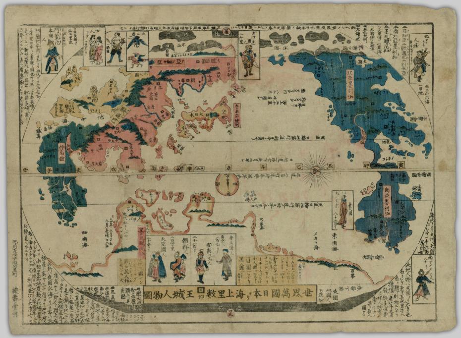
The main purpose of this project is to provide descriptions and translations of Tokugawa Era maps in order to make them more accessible to the general public. By making them more accessible we hope to educate people on how people in the past visualized the world around them, specifically from a Japanese point of view. In UBC’s Japanese Maps of the Tokugawa Era Collection, located both online and in the Rare Books and Special Collections department of the Irving K. Barber library, there is a specific map called Sekai Bankoku Nihon Yori Kaijō Risū Ōjō Jinbutsuzu. This posting will attempt to describe the previously mentioned map in comparison to other maps and how some descriptions bring about conflicts with modern generalizations.
Brief Background Information:
Sekai Bankoku Nihon yori Kaijō Risū ōjō Jinbutsu Zu is a map of all the countries of the world and pictures of the peoples, showing the capitals and their distances from Japan. The map was a woodblock print created by Eijudo, in Nagasaki during the 1850s, late Edo period; which is around the time that Commodore Perry’s ships came to Japan, as the later 1870s adaptation of this map features Perry’s black ships sailing to Japan from North America. The artists and/or cartographers who worked on this map is not known and very little is known about Eijudo. However, according to Professor Kazutaka Unno, the leading authority of Japanese maps in 1985, this map is loosely based on Mateo Ricci’s map of the world.
Map Characteristics:
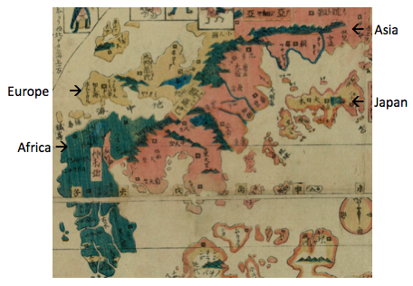
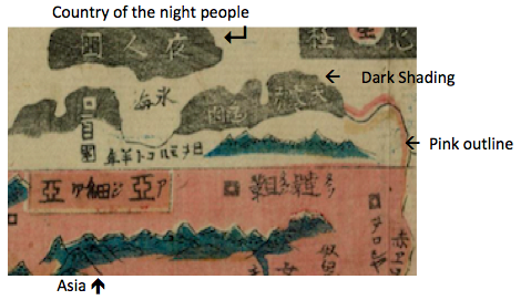
At first glance the map is filled with distortions when compared to maps like the Bankoku Sōzu or modern ones. One such distortion is that of Japan, which is featured in the center of the map and is seemingly the same size as Europe. This focus on Japan as the center is similar to and could also be a reaction to the Japanese idea that Qing China had become stagnant and no longer the center of the world, while at the same time providing evidence of the emergence of early Japanese nationalistic ideologies. Other than this we see the area labeled as Asia being longer than it is wide and located in a more northeastern direction to Europe, which itself is distorted vertically. Next we can see that Africa, the second largest continent, is shown to be slightly larger in mass than Europe and smaller than North America, which has a similar mass to that of Eurasia.
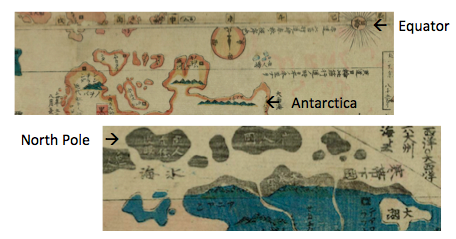
Australia does not appear as its own isolated landmass within this map; however, the way that Antarctica is distorted to the point where it almost reaches the Equator is possibly due to Australia being depicted as an extension of the Antarctic continent. Although today we view the North Pole as a solid landmass, it is made up of constantly shifting ice, which in this map possibly led it to be depicted as a cluster of smaller islands.
Along with these distortions to the continents, the colours used seem to hold some sort of meaning. One possibility behind their usage in this way is to signify different forms of otherness that the Japanese population had knowledge of during this time; seemingly separating countries by what we would consider “ethnicities”. However, due to the lack of specific knowledge on the artist’s intentions and the variations in colour usage in other prints of the same map, it is difficult to say exactly why the colours were used in this way on this particular map.
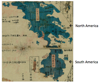
On this map we can see that Africa is shaded in a dark teal, while with Europe the colour tan is used, and in Asia pink. Looking at Japan we see that there is a mixture of colours being used: tan with pink borders. This mixture of colours could represent the notion that although the Japanese relate to the countries labeled as “Asia”, they see themselves as a separate entity. Moving east we see that both North and South America are shown in blue. When looking at the depictions of North and South Americans, we can see that they are depicted very similarly, which could represent that, although there is knowledge on the two being separate, their type of otherness is seen as being the same.
Looking at the southern and northern hemispheres we see that the lack of colour being used to fill in the country is used to represent the colder climates. For example Antarctica does have pink and tan coloured borders, but it is still white; and also when looking at the portion of “Asia” that is depicted as being north of the Arctic Circle is white with a pink border, to show that it is still considered part of Asia. The North Pole is shaded in black and is labeled as夜人国, which translates to country of the night people. This is shown throughout various different maps and depicts the fact that the Japanese had knowledge that the Arctic Circle is a place were there are large periods of perpetual darkness.
Writing characteristics:
When it comes to the written elements of this map it is important to keep in mind that the Japanese used in the 19th century was different than that used today. Classical Japanese although similar to modern Japanese, has a different set of character readings, grammatical structures, vocabulary, etc.; therefore we see in this map that the writing is a combination of kanji, Chinese characters, and katakana, phonetic alphabet, in the classical Japanese context. Because of this we see, for example, リウキウ, literally spelled in roman letters as ri-u-ki-u, but pronounced as ryu-kyu.
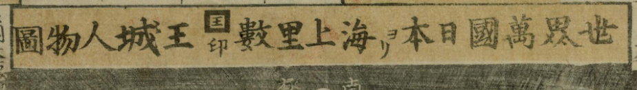
Something else that stands out about the writing is that no matter the direction it is written in, the writing is read left to right. For example the title of this map,世界萬國日本ヨリ海上里數王城人物圖 , is written as: 圖物人城王數里上 海リヨ本日國萬界世 on the map its self.
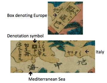
Within each of the countries the  symbol is used to denote the names of each country’s major city while boxes are used for the continents. Countries and oceans, however, do not have any specific symbol denoting them.
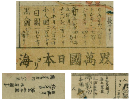
Distances between countries and japan are noted in several locations. Above the title on the left hand side is a yellow box, which serves as the primary location for distance notation. For North and South America they are written in between the two horizontally. Also next to the depictions of the different nations, both the name of the people and their countries distance from Japan are noted.
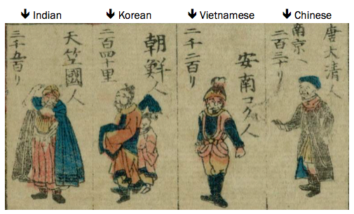
Depictions of People:
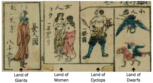
Within this world map there is the depiction of 12 nationalities, from which eight are existing countries and four are fictional. These depictions were also made to show the natural and cultural differences based on human characteristics such as skin colour, build, etc., which are based on the Jinbutsuzu, the accompaniment to the Bankoku Sozu, and show the artists’ opinions of that country’s distinguishing characteristics. Such depictions of people on maps are a unique characteristic of Edo Era maps as it is rare to see such depictions on maps from before or after. The existing countries include China, Korea, India, Vietnam, Tatar, South America, North America, and Holland; while the fictional ones are: Land of Giants, Land of Dwarfs, Land of Cyclops, Land of Women.
The nationalities displayed also follow the nation hierarchy established in Nishikawa’s Ka’I tsusho ko: China à Gaikoku à Gai’i à Holland’s trade partners à Others. We see this with the group of nationalities illustrated above the map’s title where India, Korea, Vietnam, and China are depicted. In the Japanese hierarchy of countries first in the list is China, followed by the Gaikoku category, which consists of countries, like Korea and Vietnam that are not part of China but are within its sphere of influence.
After these two categories we have gai’i, which are both outside of the Chinese imperial system and trading partners with china, the main example being countries like Holland followed then by Holland’s trading partners.
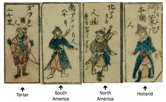
At the end of this gai’i category there are another thirty-six countries, which include the fictional countries, such as the Land of Giants. We see this hierarchy shown as the countries that fall under the gai’i category are spread out around the map, unlike China and those in the gaikoku category.
Conclusion:
The Sekai Bankoku Nihon yori Kaijō Risū ōjō Jinbutsu Zu is a map created in the late Edo period, which depicts the world and people within it in such a way that it expresses the artist’s opinions and knowledge of the larger world. The world map has various distortions, shown through colour and country size, which could be representative of popular beliefs or ideologies within Japan at the time. The writing on this map is in Classical Japanese, written right to left and in a kanji-katakana combination, which is used to provide labels, descriptions, and distance information that the artist is trying to convey. Illustrations found around the map are provided in a hierarchal order to give a face to the “heard but not seen” people in foreign countries. Because of the artistic liberties taken with this map it is very likely that it was treated as something to be put on display or as an occasional reference, rather than for travel purposes.
References:
Eijudō. “Sekai bankoku Nihon yori kaijō risū ōjō jinbutsu zu, 1850” University of British Columbia Library – Rare Books and Special Collections: Japanese Maps of the Tokugawa Era. open.library.ubc.ca/collections/tokugawa/items/1.0167776#p0z-3r0f
Gonnami, Tsuneharu. “Images of Foreigners in Edo Period Maps and Prints.” Open Collections UBC, Journal of East Asian Libraries, 1998, open.library.ubc.ca/handle/2429/21181.
Unknown. “Early Japanese Maps of the Word.” MYOLDMAPS, http://www.myoldmaps.com/the-first-japanese-map-of.pdf.
Unknown. “Bankoku sōzu, 1600” University of British Columbia Library – Rare Books and Special Collections: Japanese Maps of the Tokugawa Era. open.library.ubc.ca/collections/tokugawa/items/1.0213137#share
Yonemoto, Marcia. “Mapping Early Modern Japan: Space, Place, and Culture in the Tokugawa Period, 1603-1868.” University of California Press, 2003.
Contributor: Hannah Litman
Published April 26, 2018

You must be logged in to post a comment.